

U.S. Senate
See Full Big Line
(D) J. Hickenlooper*
(D) Julie Gonzales
(R) Janak Joshi
80%
20%
10%
Governor
See Full Big Line
(D) Michael Bennet
(D) Phil Weiser
55%
50%↑
Att. General
See Full Big Line
(D) Jena Griswold
(D) M. Dougherty
(D) Hetal Doshi
40%↓
30%
30%
Sec. of State
See Full Big Line
(D) J. Danielson
(D) A. Gonzalez
50%↓
30%↑
State Treasurer
See Full Big Line
(D) Jeff Bridges
(R) Kevin Grantham
80%↑
20%↓
CO-01 (Denver)
See Full Big Line
(D) Diana DeGette*
(D) Milat Kiros
(D) Wanda James
70%↓
20%↑
10%↓
CO-02 (Boulder-ish)
See Full Big Line
(D) Joe Neguse*
(R) Somebody
90%
2%
CO-03 (West & Southern CO)
See Full Big Line
(R) Jeff Hurd*
(D) Alex Kelloff
(R) H. Scheppelman
60%↓
30%↓
20%↑
CO-04 (Northeast-ish Colorado)
See Full Big Line
(R) Lauren Boebert*
(D) E. Laubacher
80%
20%

CO-05 (Colorado Springs)
See Full Big Line
(R) Jeff Crank*
(D) Jessica Killin
53%↓
48%↑
CO-06 (Aurora)
See Full Big Line
(D) Jason Crow*
(R) Somebody
90%
2%
CO-07 (Jefferson County)
See Full Big Line
(D) B. Pettersen*
(R) Somebody
90%
2%
CO-08 (Northern Colo.)
See Full Big Line
(R) Gabe Evans*
(D) Shannon Bird
(D) Manny Rutinel
45%↓
30%
30%
State Senate Majority
See Full Big Line
DEMOCRATS
REPUBLICANS
80%
20%
State House Majority
See Full Big Line
DEMOCRATS
REPUBLICANS
95%
5%
[wpdreams_ajaxsearchlite]
 October 04, 2011 01:36 AM UTC
 NOTE: Since this is a bipartisan project, we’ve introduced a new rating system. Each sign will now be rated on a scale of 1-5 “Elephonkeys.”
  LESLEY DAHLKEMPER
 SAOIRSE CHARIS-GRAVES
 KAREN KELLEN
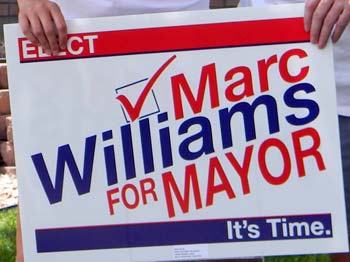 MARC WILLIAMS
 JENNIFER DRAPER CARSON
 ZACHARY URBAN
 DENNIS COOMBS
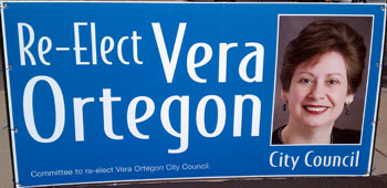 VERA ORTEGON
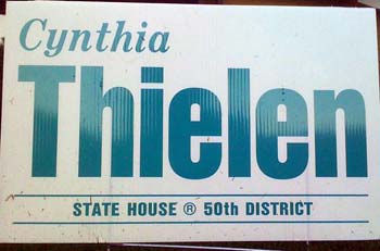 CYNTHIA THIELEN
 HAPPY HAYNES
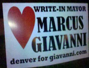 MARCUS GIAVANNI
 JACQUI SHUMWAY
 KEVIN MUELLER
 NO ON PROPOSITION 103
Comments